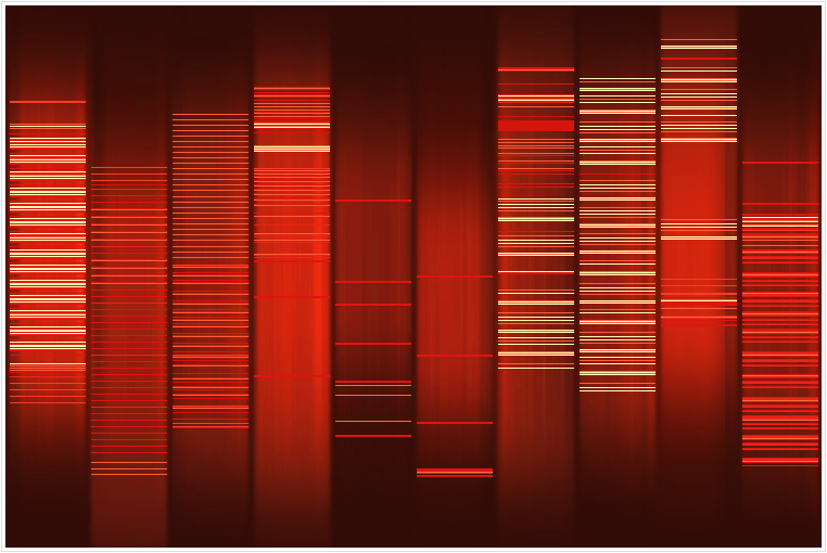
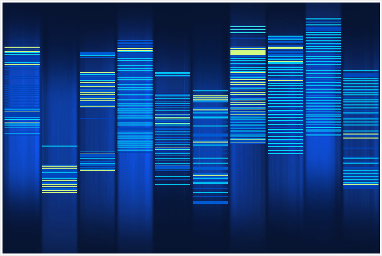
Web 2 DNA ART PROJECT에서 트랙백.
http://www.baekdal.com/web2dna/ 에서 만들 수 있다고 나오는데, 문제는 이걸 어떻게 해석해야하나 모르겠습니다. ( -_-)
생성기준은 이렇군요:

생성기준은 이렇군요:
How it works
WEB2DNA will take you website, analyze it, crunch it to little bits and spit it out as a graphic representation of a human DNA.
The brightness of the lines is determined by the importance of the tags in terms of structure.
* H1 is brighter than H2, which is brighter than H3.
* TABLE is brighter than TR, which is brighter than TD tags.
* Images and flash elements appear as 70% white.
* New HTML tags like STRONG and EM is brighter than older ones like B and I
* UL, OL and DL is brighter than their LI, DT, DD
* DIV layout is brighter than table layout
* TABLE is brighter than TR, which is brighter than TD tags.
* Images and flash elements appear as 70% white.
* New HTML tags like STRONG and EM is brighter than older ones like B and I
* UL, OL and DL is brighter than their LI, DT, DD
* DIV layout is brighter than table layout
Basically a semantically rich site will appear brighter than one with messy old-style code.
You can also determine the richness of text on a site. A site the focuses on (text) content is one where the DNA patterns is large (filling many containers), but contains a lot of empty spaces between the lines (empty space is the individual words).
웹페이지 제작시 사용하는 CSS, Tag 등을 분석하는 듯 합니다. 아무래도 저 밝은 부분이 적으면 적을 수록 좋은 것 같은데..;; 뭐 티스토리야 태터툴즈에서 만드는 툴이니 전 모릅니다(책임 회피).
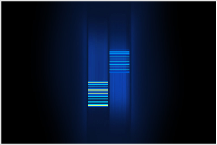
참고로 구글의 DNA 지도:

아, 저 사이트 오른쪽 위에 보니 “THE GOAL IS PRETTY SIMPLE”이라는 어구가 있군요. 휘황찬란하지 않아야 좋은건가봅니다. -_-;


Pingback: LOSER's Hideout